MAXQDA can be used to analyze how frequently codes were assigned in selected documents. The results can be presented as a table or chart. The analyses can refer to the top-level codes or the subcodes of any parent code. The subcodes of lower levels can be included optionally.
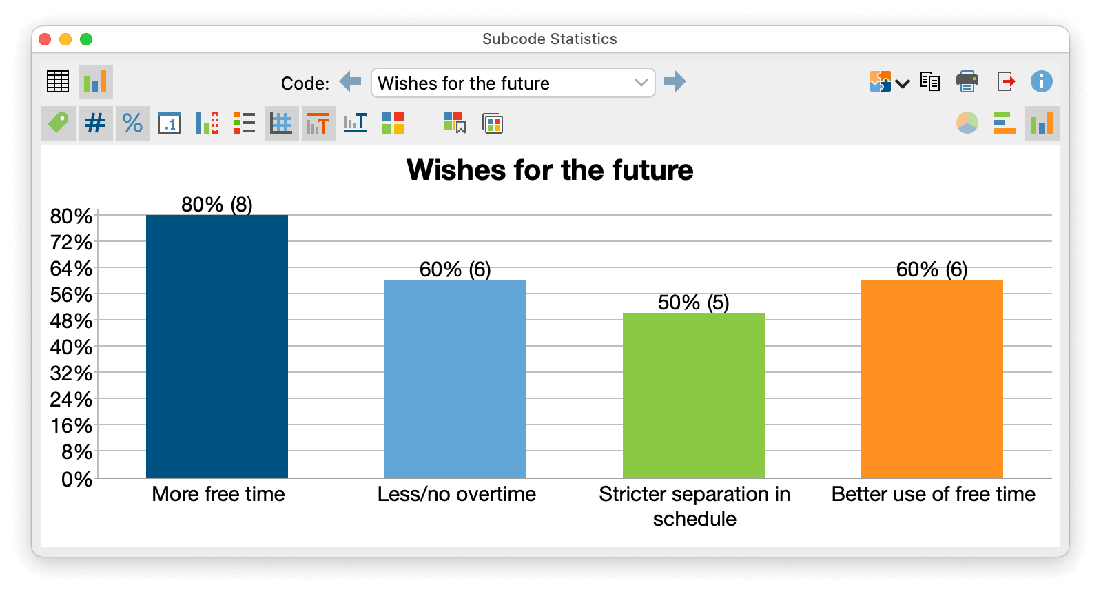
How to analyze the frequencies of subcodes
- Start the function Codes > Code Statistics > Subcode Statistics
- The following dialog appears:
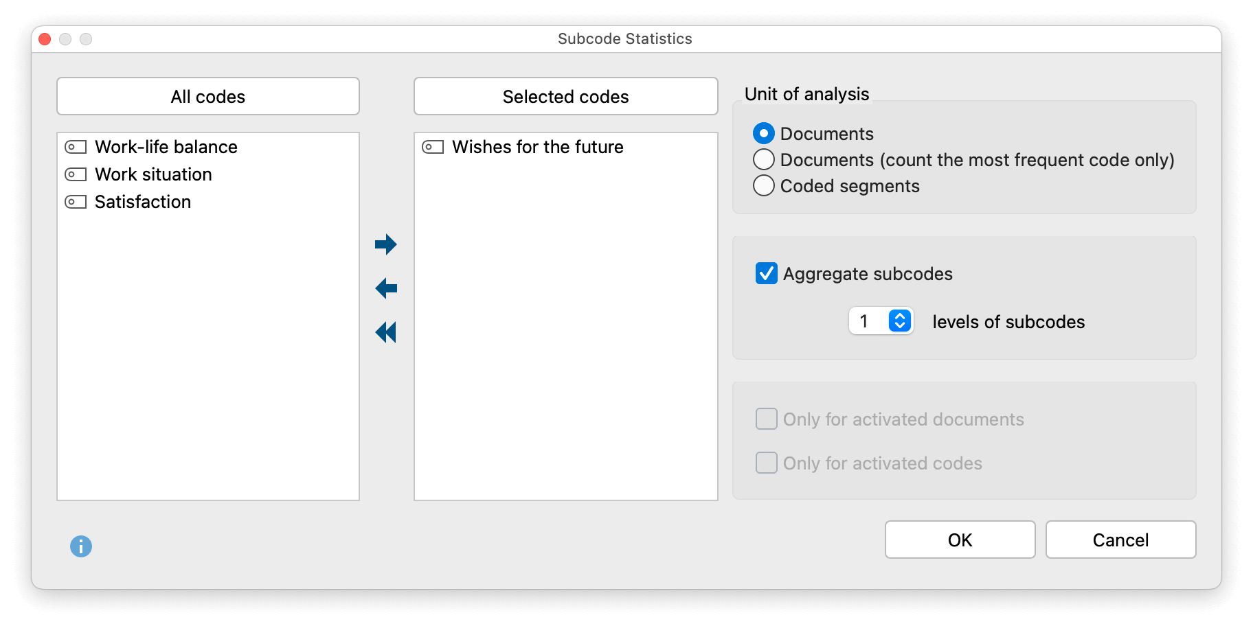
- On the left side, all the top-level codes from the “Code System” are listed. Select one of the codes by clicking on the arrow or by double-clicking on it. By clicking on the column headers, the two lists can be sorted alphabetically.
- Set the desired options on the right:
Unit of analysise- Documents – The number of documents in which the respective subcode was assigned is output. This can be used, for example, to answer the question: “How many cases mentioned a particular topic?”
- Documents (count most frequent code only) – The number of documents in which the respective subcode was most frequently assigned is output. This can be used, for example, to answer the question: “In how many cases does a particular topic dominate?”
- Coded segments – The number of coded segments per subcode is output.
Aggregate subcodes – If this option is selected, not only the direct subcodes of the selected parent codes will be considered in the analysis, but also of lower-level codes up to the specified subcode level. All codes on lower levels will be aggregated to the parent code during the analysis and only this code will be displayed in the results table.
- If necessary, limit the analysis to the currently activated documents and codes by selecting the appropriate option..
- Start the analysis by clicking OK.
The results table
If one of the two options for “Documents” was selected for “Unit of analysis”, the results table will contain the following rows:
| Code “A” | Number of documents in which code “A” occurs. |
| Code “B” | Number of documents in which code “B” occurs. |
| Code "C" | Number of documents in which code “C” occurs. |
| not defined | Number of documents in which there is no most frequent code because several codes are most frequent. |
| DOCUMENTS with code(s) | Number of documents in which AT LEAST ONE of the evaluated subcodes occurs. |
| DOCUMENTS without code(s) | Number of documents in which NONE of the evaluated subcodes occur. |
| ANALYZED DOCUMENTS | Total number of documents evaluated. |
The “not defined” row is visible only if the “Documents (count most frequent code only)” option is selected.
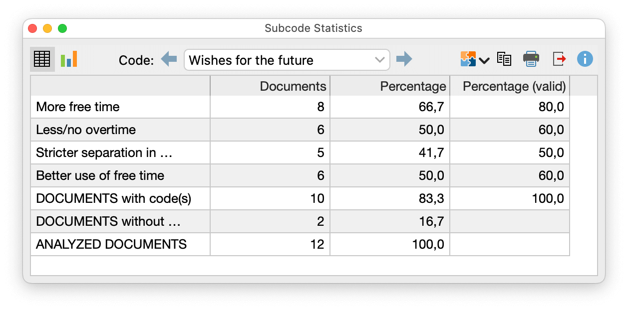
The “Percent” column considers all the analyzed documents, while the “Percent (valid)” column considers the “Documents with code(s)” only.
If the option “Coded segments” was selected for “Unit of analysis”, the results table contains the following rows:
| Code “A” | Number of coded segments with code “A”. |
| Code “B” | Number of coded segments with code “B”. |
| Code “C” | Number of coded segments with code “C”. |
| TOTAL | Sum of coded segments |
Toolbar functions
![]() Chart view – Displays the results of the frequency table as a chart (the functionality is described in detail below).
Chart view – Displays the results of the frequency table as a chart (the functionality is described in detail below).
![]()
![]() Previous/Next – Switches to the previous/next results table if multiple parent codes have been selected for the analysis.
Previous/Next – Switches to the previous/next results table if multiple parent codes have been selected for the analysis.
How to analyze the frequencies of top-level codes
Instead of subcodes of a selected parent code, you can also request statistics for the top-level codes: Codes > Code Statistics > Top-Level Code Statistics.
The options dialog corresponds to the dialog for subcodes explained above, except that no parent codes can be selected on the left side.
The results table also corresponds to the table for subcodes.
Charts
Once you have switched to the chart view by clicking on the ![]() icon, the results from the frequency table are visualized as a chart.
icon, the results from the frequency table are visualized as a chart.

You will see two toolbars at the top of this window. The upper toolbar is the same as for the frequency table, and you can switch at any time to the table view. On the right side of the lower toolbar, you will see three buttons, with which you can choose between pie chart, horizontal, and vertical bar chart. The chart can be customized using the options in the lower toolbar:
![]() Display labels – show categorical labels of bar and pie charts.
Display labels – show categorical labels of bar and pie charts.
![]() Display absolute values – show absolute frequencies.
Display absolute values – show absolute frequencies.
![]() Display percentages – show relative frequencies.
Display percentages – show relative frequencies.
![]() Display decimals – if percentages are displays, the values are displayed with one decimal.
Display decimals – if percentages are displays, the values are displayed with one decimal.
![]() Display missing values – show missing values category.
Display missing values – show missing values category.
![]() Display legend – show the legend, which is switched “off” by default in bar charts.
Display legend – show the legend, which is switched “off” by default in bar charts.
![]() Display scale – show the scale axis in bar charts.
Display scale – show the scale axis in bar charts.
![]() Display title – show diagram title.
Display title – show diagram title.
![]() Display text – show textual description of diagram.
Display text – show textual description of diagram.
![]() Change color scheme - opens window for color scheme selection.
Change color scheme - opens window for color scheme selection.
![]() Set as default design for new diagrams - saves the current design and automatically applies this design to new charts.
Set as default design for new diagrams - saves the current design and automatically applies this design to new charts.
![]() Apply current style to all created diagrams - applies the current style to all currently created charts.
Apply current style to all created diagrams - applies the current style to all currently created charts.
Customizing chart captions, colors, and font sizes
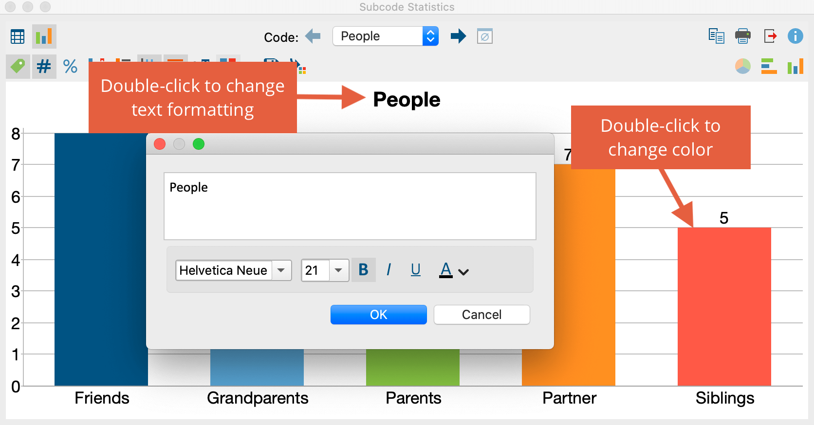
- Double-click on a bar or pie segment to overwrite the given color of the color scheme.
- Double-click on the title, the description, or the category label to customize the text and its font.
- Double-click the text on axes to customize its font. For the size axis, the height of the axis can also be determined.
Store results in a QTT worksheet
In the Questions – Themes – Theories window of MAXQDA, you can collect and comment on all the important results of your project. In the upper right corner of the table or chart view, click on the icon ![]() Send to QTT Worksheet to store the results in a new or existing worksheet. The current display will be saved as an image.
Send to QTT Worksheet to store the results in a new or existing worksheet. The current display will be saved as an image.
Printing and exporting results
In the toolbar in the upper right corner there are three icons that can be used to export and print the frequency tables and charts:
![]() Copy – The whole window content is copied to the clipboard, so you can copy the results into a report or presentation without any detours, for example, by using Ctrl+V (Windows) or ⌘+V (macOS).
Copy – The whole window content is copied to the clipboard, so you can copy the results into a report or presentation without any detours, for example, by using Ctrl+V (Windows) or ⌘+V (macOS).
![]() Pint – Prints the whole window content.
Pint – Prints the whole window content.
![]() Export – Exports frequency tables as Excel files or as web pages in HTML format. Exports charts as image files in PNG or SVG format or (in Windows only) in EMF format.
Export – Exports frequency tables as Excel files or as web pages in HTML format. Exports charts as image files in PNG or SVG format or (in Windows only) in EMF format.
